This Blog has been set up to show the development of the series Earth in its multiple formats. This blog will also show what inspires the creator of the series and what makes the series flow together.
Showing posts with label Design. Show all posts

Saturday, 12 December 2009

Leviathan - A Corridor Test 1

I've started work on 3D Sets for all three series so here's the first set of renders for The Leviathan. The floor textures aren't the final version and I might want to consider adding a few things here and there but it is close to the finished corridor.

And now for a change of colour - RED ALERT!!!
And a special render inspired by a shot from James Cameron's Titanic.


No water and exploding doors yet but give me time and there might be.

Coming up a test render of the Red Alert Lights.

Saturday, 14 November 2009

Changes

"The Eye of Harmony was created so that things would never flux, nor wither, nor change their state in any way." Romana II

"These things are rarely true." My Opinion

With Pitch and Crit over. I've decided to go over what I'm making and what I'm researching. So far the changes are pretty drastic. I'll do my best to cover what I've changed.

Originally there was going to be three formats.
1. Radio Drama
2. Flash Game Series
3. Animated Shorts

I've decided to change the three formats to
1. Animated Series
2. Point and Click Adventure Game (Episodic)
3. Animated Shorts

Two complete changes yet on the outside it's not that different. Also the style of the series has changed.

The Animated Series, will still be called Darwin's Journey. It will still be about the life of Lewis Darwin as he tries to escape his destiny. It will be animated instead of an audio drama. Since the scripts were written with the audio medium in mind changes will have to happen. Eventually.

The Point and Click Adventure Game is Jacob's Story it will still have the same story and will be about how Jacob Anderson works with the Free Earth Rebellion and with the chance, save the world. When writing it, I was focused on being serious. Now that's changed and I've decided to add humor to the story and so far, according to one person (My Dad) it's funny. So I'm going to keep working on that front.

Animated Shorts, Now here comes the biggest change. It's no longer called Launch of the Leviathan. It has been renamed and there will be a huge media fanfare when the new title is launched but so far it's mostly the same with new angles to focus on.

The Research Question is still in flux. It will always be in flux as with any good question. So Far it's evolved from how to tell a large story using new media into something quite similar yet harder to define. So In the end I will hopefully have a good question and some very good results.

Monday, 9 November 2009

Jacob's Story - Concept Art

And now for some concept art from


This piece of concept art is for the North Atlantic Platform 3. It is the location for the final three episodes of Jacob's Story.


And that's it for now. To come up with this design I focused on the design of Oil Rigs and how they look as they sink into the sea. There's a possible spoiler in there for those that look hard enough.

Wednesday, 14 October 2009

Logo Design


There are many familiar logos in the world of entertainment. There are many you can see by turning on the TV. For Example there's the Eastenders Logo. It has survived several redesigns of the title sequence.


The Original Titles with the Original Logo


The 2009 Title Sequence with the same Logo as the Original

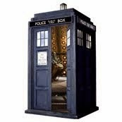
Another example is Doctor Who. With each change of the main actor the series title sequence was also changed.


1963-1964
William Hartnell's Era and the First Season of Patrick Troughton's.


1973-1979
The Last Year of Jon Pertwee's Era and the majority of Tom Baker's Era
It also featured the iconic Diamond Logo.


2005-2010
Christopher Eccelstone's Era and with minor modifications, David Tenant's Era

So when I came up with the Logo for Earth I didn't really think about the context it would appear in. I came up with the logo by looking through the list of fonts that my current computer at the time originally had and I picked the best one that I thought was the best.

At the time I created it I had no idea about how it would look with a little artistic flare. Insomnia is a good time to be creative. Not only do you come up with a good idea it also makes you tired.


This is is the final article. It will appear with the three different formats that I intend to tell the story. Hopefully there will be a title sequence later where the Logo will fit in.